What is keyboard navigation?
Keyboard navigation means using the keyboard to browse the web, instead of a pointer like a mouse or touchscreen.
How does keyboard navigation work?
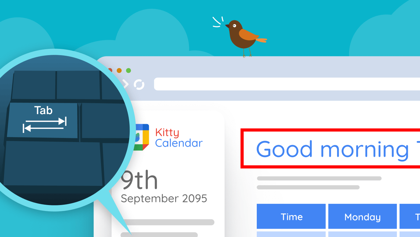
The basic idea is you can only do three things: step forward, step backward, and activate interactive elements. On a regular keyboard, you do this with Tab, Shift + Tab, and Enter (or Return).
It’s like using a menu in a computer game: forwards and backward let you select the option you want, and the activation button interacts with it (e.g. pressing a button, or clicking a link). In many cases, you can browse the web with just these keys.
How does keyboard navigation impact web accessibility?
Keyboard navigation is not something that many people do with a normal keyboard – it’s usually a means for Assistive Technologies to control a web browser. So if a website can be used via a keyboard, it will also work via many Assistive Technologies.
Imagine that instead of pressing the (somewhat awkward) keys like Shift + Tab together, you have three big buttons, which correspond to forwards, backward, and select. That’s the mental model that generalizes across a lot of Assistive Technology.
There are many insights revealed by keyboard navigation:
All interactive elements must be selectable
Not all websites are written in a way that you can even select the interactive elements you need.
For example, you would expect to be able to select the links, buttons, and form controls on a page. But if any of these are programmed in an inaccessible (usually non-standard) way, this may not be possible, making those parts of the page unusable.
You must be able to see what is selected at any time
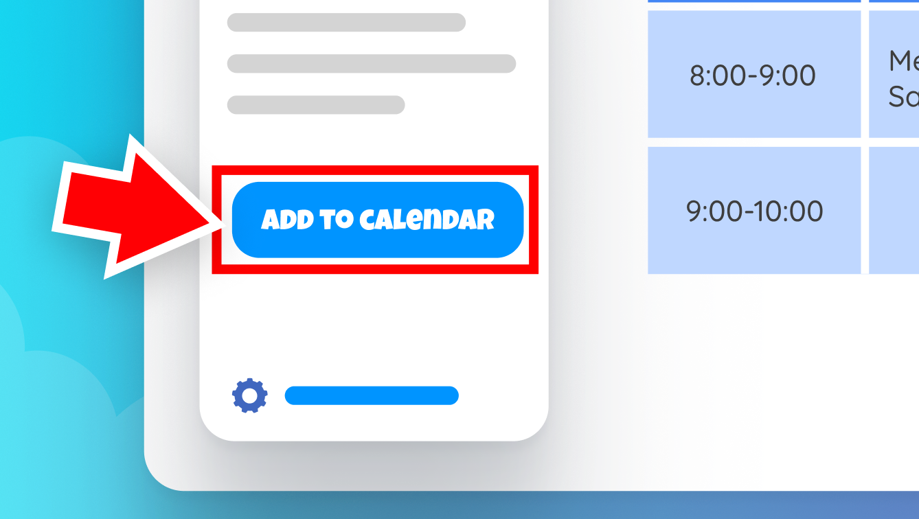
When using keyboard navigation, unlike with a pointing device like a mouse, you need some way of identifying what is currently selected:

This is known as the focus indicator, and it’s important that (a) it exists, and (b) is clear and easy to identify wherever it is used.
Many websites can disable the focus indicator without realizing its intended purpose or can use an indicator so subtle that it’s nearly impossible to identify, especially for people with visual impairments. Remember that overlapping disabilities are more common than you might expect.
Everything should be accessible via three buttons
Some websites or web applications will have controls like drag and drop, where a user points a mouse somewhere, holds down a button, drags to another location, and lets go.
This type of operation is fundamentally impossible with three buttons. There’s no spatial context – i.e. up/down/left/right – just a linear order. And you can’t depress multiple buttons at once, so you can’t hold down a button and move elsewhere.
This doesn’t mean you can’t use drag-and-drop in your websites. Instead, operations like this should have an accessible alternative, such as an up/down button, or other keyboard shortcut, which permits the equivalent functionality in a different way.
If there are a lot of options, you should allow users to skip the repetitive ones
Imagine that you can only browse a website by stepping through every link on the page, one at a time. Now imagine you also have a physical impediment, so that pressing a button is unusually exerting for you. Finally, imagine the news webpage you just landed on has 100 menu options in the top navigation.
Stepping through dozens or even hundreds of links can be physically demanding, or even impossible, for some users. This can be avoided by including at least one link at the top, called “Skip to content”, which moves the focus to the start of the main content area. This is common enough that it’s become a widely expected best practice.
For websites with other long repetitive blocks of links elsewhere on the page, adding a link to skip those can have a similarly beneficial effect.
Don’t trap the focus
Some websites limit the options that you can select when, for example, a pop-up or modal opens. Unless there is a selectable control that can exit this trap, the user no longer has any way to use the webpage, because all they have is buttons for forward, backward, and select.
Building for better keyboard navigation
To improve keyboard accessibility on your site, follow these principles:
- Have a visible focus indicator. Always make it clear which element is currently focused to aid navigation.
- Logical tab order. The navigation order should follow the visual order, so keyboard users find it logical and predictable.
- Provide skip links. This allows users to skip repetitive content and get to the primary content quickly.
- Make all actions accessible. Ensure every action that can be performed with a mouse can be performed with a keyboard.
Conclusion
Improving keyboard navigation is a crucial aspect of web accessibility.
It allows more users to access content and interact with websites efficiently, no matter their physical abilities or personal preferences. By building with keyboard navigation in mind, we make the web more inclusive, allowing everyone to participate fully in the digital world.
