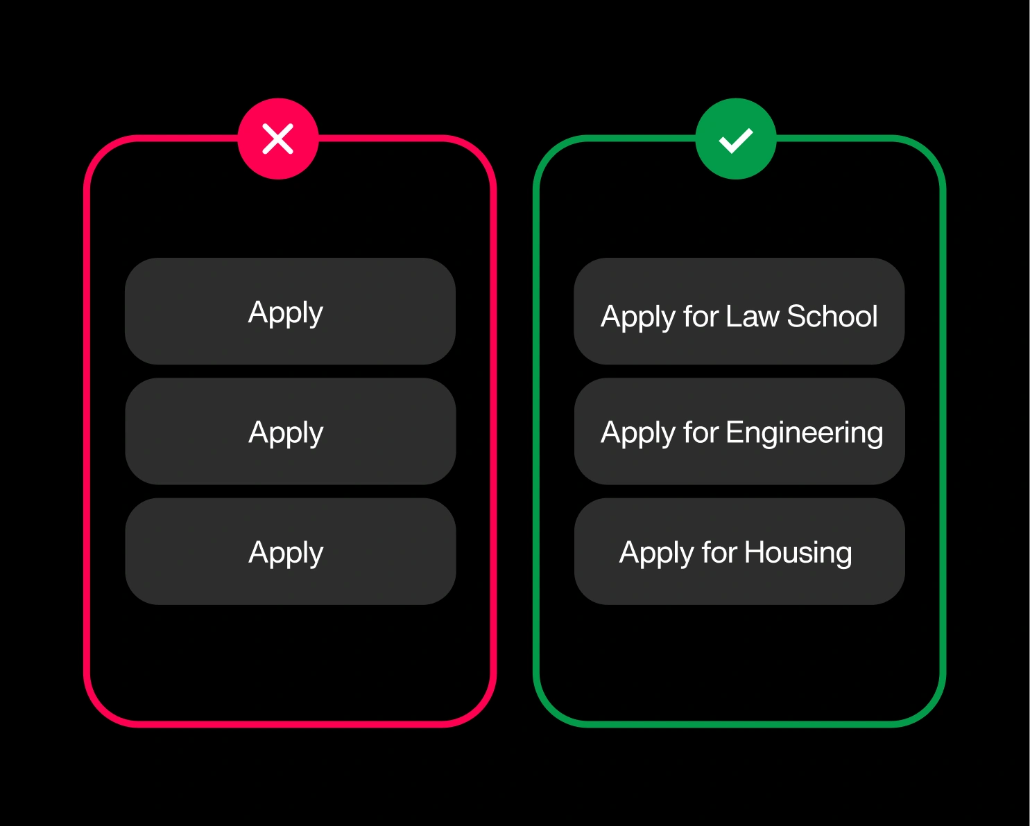
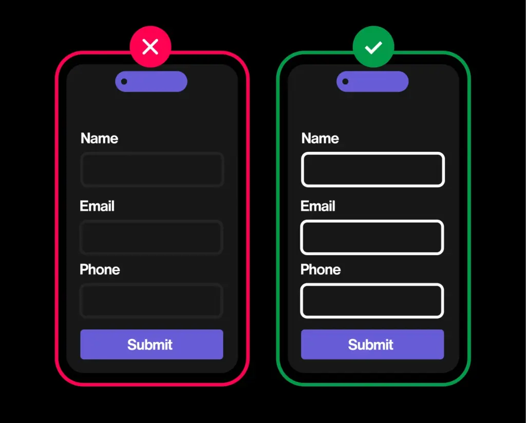
01/ Identical link text points to different places
WCAG: Link Purpose (In Context) · Level A · 96%
University sites are link-dense: programs have links, departments, deadlines, and forms have links, even links have links. The trouble starts when a dozen links all read “Apply” or “Learn more” but each points somewhere different. A screen-reader user who pulls up the page’s list of links sees the same phrase on repeat, with no way to tell them apart. At 96%, it’s the most common 2.1 failure we see across higher ed, and it’s a content habit, not a code bug..
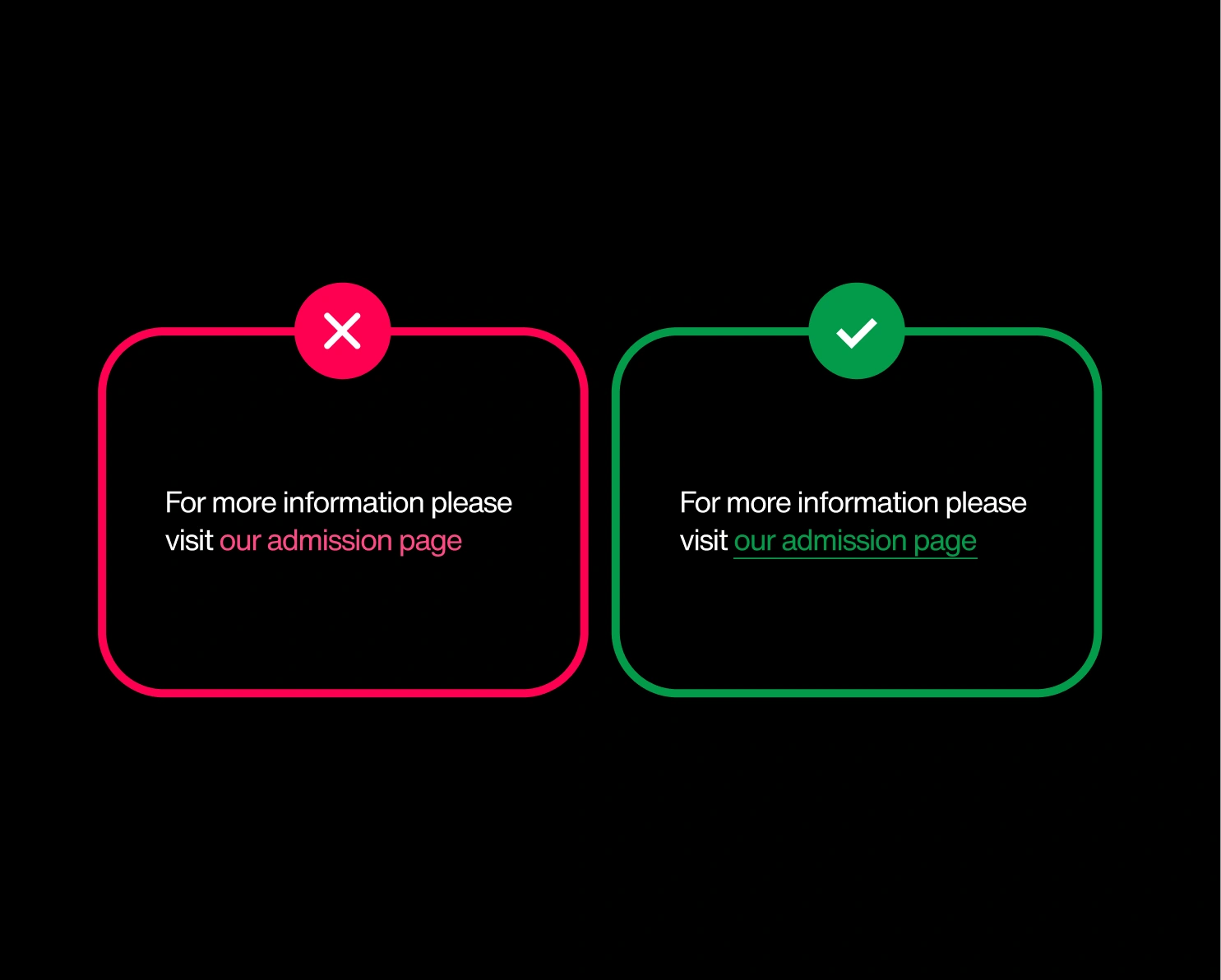
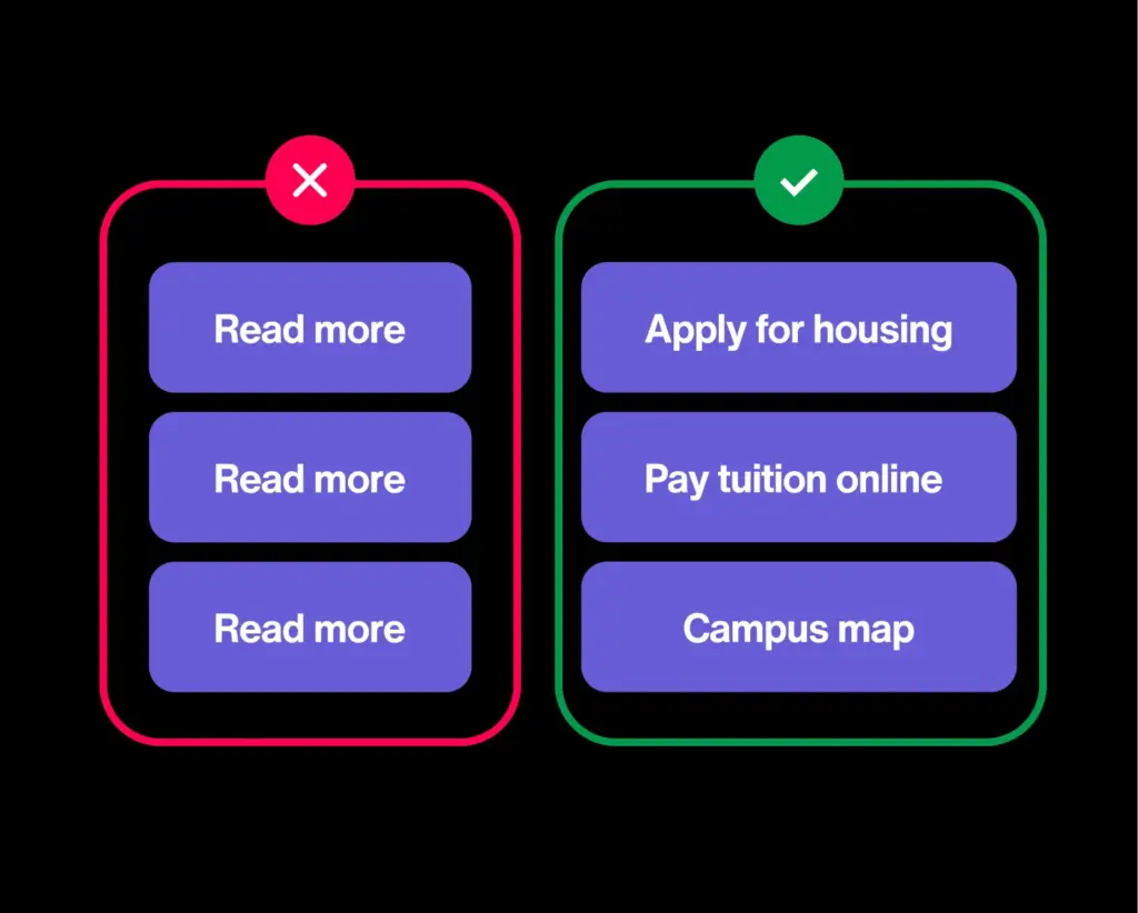
02/ Links don’t explain their purpose
WCAG: Link Purpose (In Context) · Level A · 83%
Link text should stand on its own — “Apply for housing,” not “click here.” More than 8 in 10 sites still lean on “read more” and “learn more,” which tell screen-reader users nothing — especially when they pull up a list of every link on the page. A screen full of identical “read more”s is a dead end.
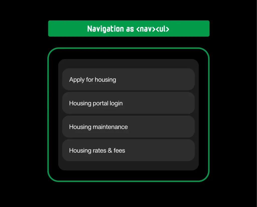
03/ Link groups and lists not written semantically
WCAG: Info and Relationships · Level A · 81%
Navigation and footer links should be coded as a structured list, so a screen reader can announce the group and its size. On around 8 in 10 sites they’re a loose pile instead, stripping out that grouping right where people navigate most. Small nuance, outsized friction.
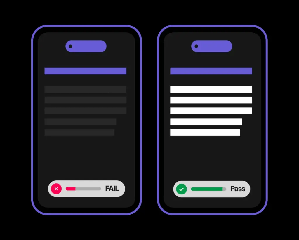
04/ Insufficient text contrast
WCAG: Contrast (Minimum) · Level AA · 76%
Contrast is the brightness gap between text and its background; AA requires at least 4.5:1 for normal text. Around three-quarters of sites fall short with on-trend light-grey-on-white, or brand colors floated over a photo. Anyone with low vision, color blindness, or a phone in daylight is left squinting.
05/ Duplicate element IDs
WCAG: Parsing· Level A · 73%
Every element ID on a page is meant to be unique. It’s how labels, ARIA, and scripts find the right thing to point at. Reuse the same ID twice (easy to do when pages are stitched together from templates and widgets) and those connections quietly cross their wires. Nearly three-quarters of university sites do it somewhere.
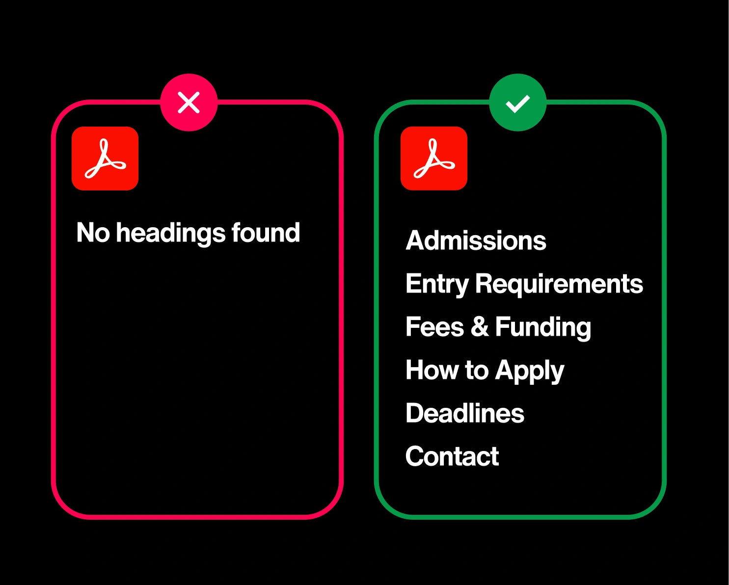
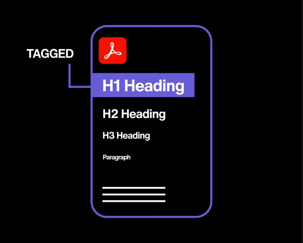
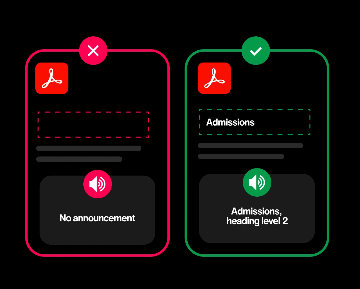
06/ PDFs have no heading structure
WCAG: Info and Relationships · Level A · 72%
Inside a well-built PDF, headings act like a table of contents a screen reader can jump through. Strip them out (as most exported-from-Word documents do) and the reader is stuck scrolling top to bottom with no way to skip ahead. For a sector that publishes everything from syllabi to financial-aid guides as PDFs, it’s a structural gap on 7 in 10 sites.
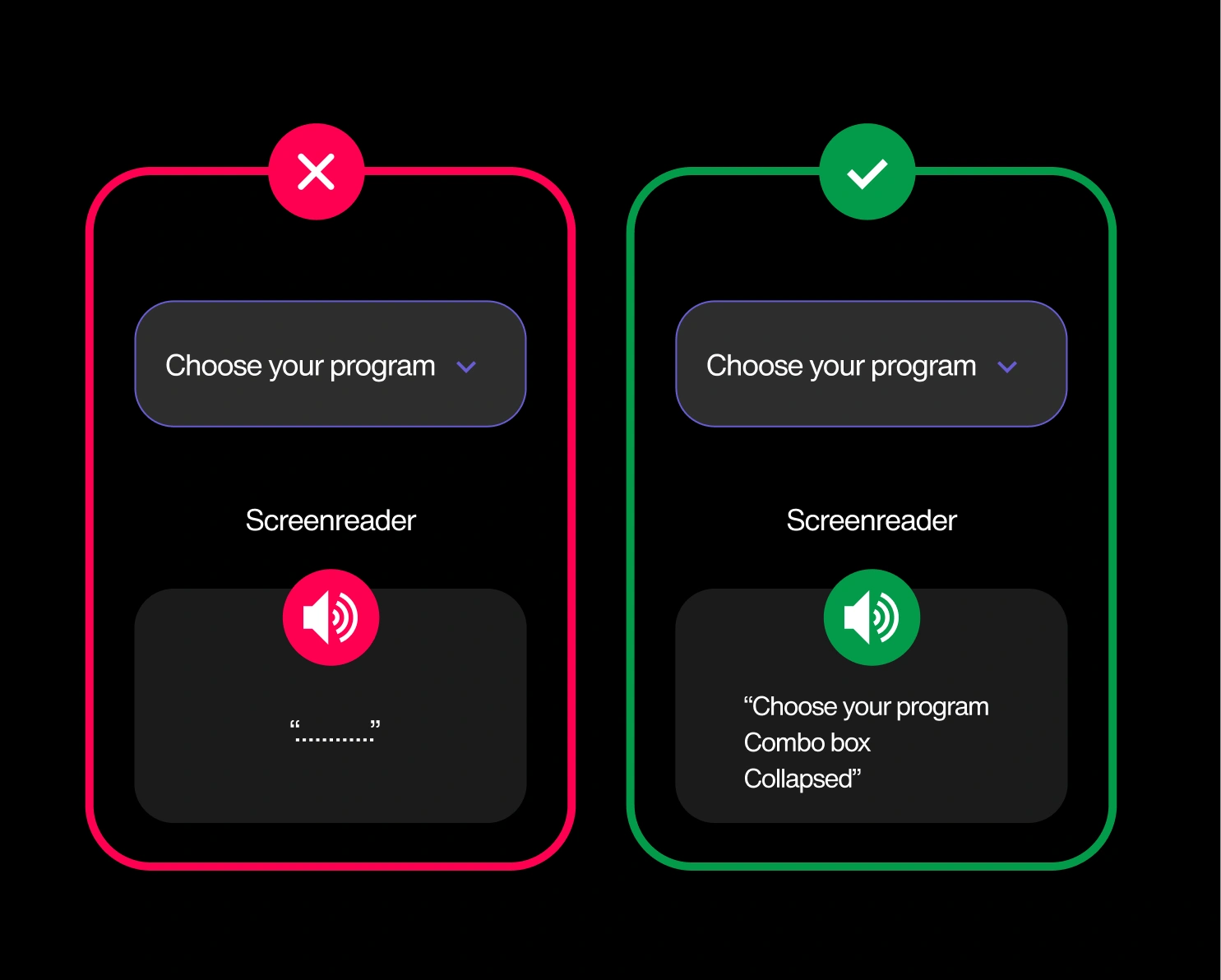
07/ Custom controls screen readers can’t use
WCAG: Name, Role, Value · Level A · 69%
Custom dropdowns, tabs, and menus built without a proper name and role announce as nothing. A screen-reader user tabs onto a “Choose your program” control and hears silence—no label, no clue it’s even a dropdown. Roughly 7 in 10 university sites ship at least one. It’s the cost of a custom component that skipped the accessibility step.
You could check all this by hand. You won’t, though.
Nobody can manually test thousands of pages and PDFs against dozens of WCAG criteria, then keep them fixed every time a department updates a page. That’s not a knock on your team — it’s arithmetic. Silktide’s accessibility experts do exactly this for institutions like yours: all 17 of these, plus the hundreds that never make a top-17 list.
08/ Form controls don’t contrast with their surroundings
WCAG: Non-text Contrast · Level AA · 69%
Non-text contrast covers the visible edges of inputs, checkboxes, and buttons — they need to stand out from the background too. On around 7 in 10 sites they’re so faint you can’t see where a field begins, so low-vision users miss them and forms go unfinished. It’s the text-contrast problem’s quieter cousin.
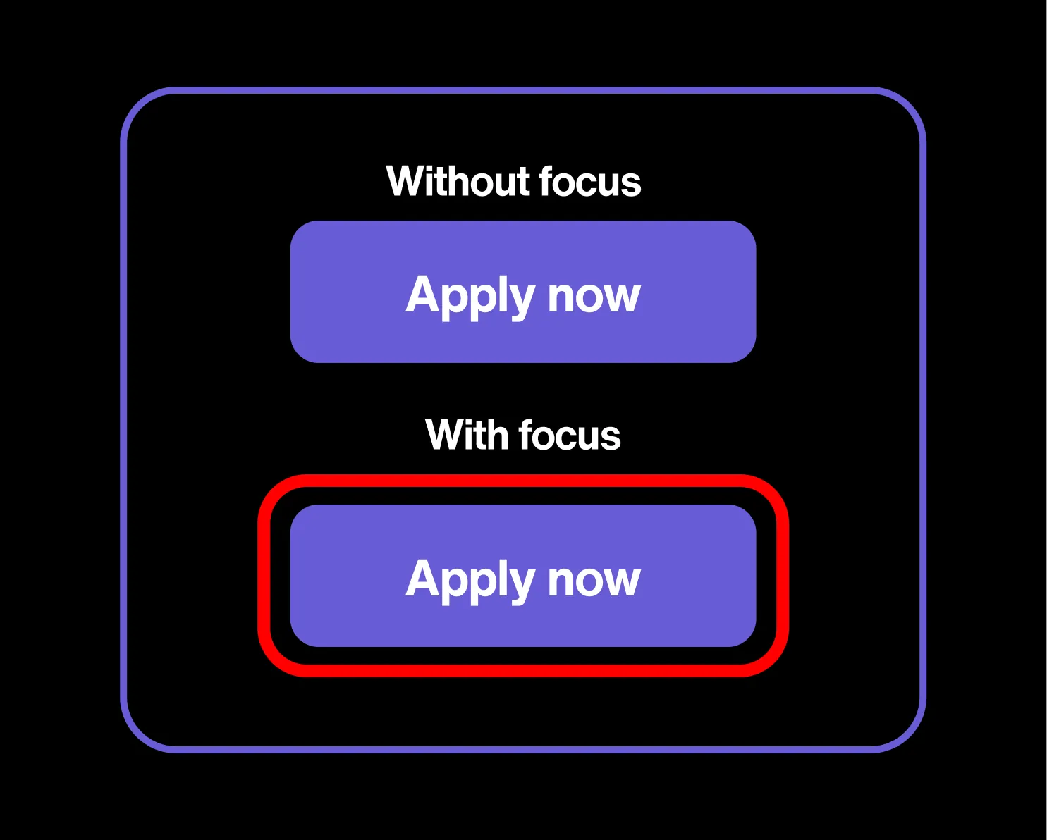
09/ No visible focus indicator on controls
WCAG: Focus Visible · Level AA · 65%
Tab through a page instead of using a mouse, and a focus indicator — an outline or highlight — should show which link or button you’re on. On around 2 in 3 university sites, it’s missing or invisible. Keyboard users (many with motor or vision disabilities) are left guessing where they are and what they’re about to activate. It’s the sector’s most common real failure, and one of the simplest AA wins to ship.
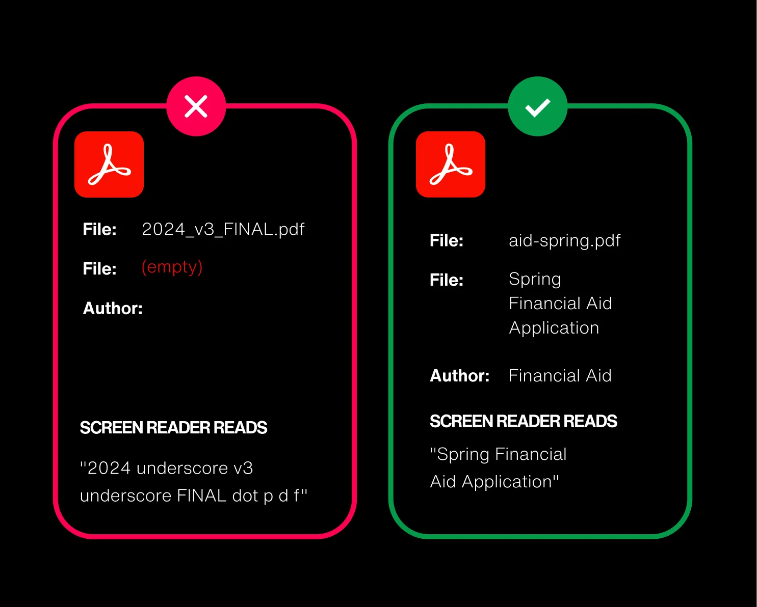
10/ PDFs have no title
WCAG: Page Titled · Level A · 64%
Every PDF can carry a title in its properties — the human-readable name a screen reader announces when the file opens. On nearly 2 in 3 university sites it’s blank, so a blind user hears “2024_v3_FINAL.pdf” instead of “Spring Financial Aid Application.” For a sector that runs on PDFs, it’s a glaring Level A miss.
11/ PDFs not tagged
WCAG: Info and Relationships · Level A · 59%
Tags are the invisible structure inside a PDF — headings, reading order, lists, tables — that assistive tech depends on. On nearly 3 in 5 sites PDFs ship untagged, so a screen reader reads them as one structureless mumble, or can’t read them at all. Stacked on untitled PDFs, documents are the sector’s single biggest content gap.
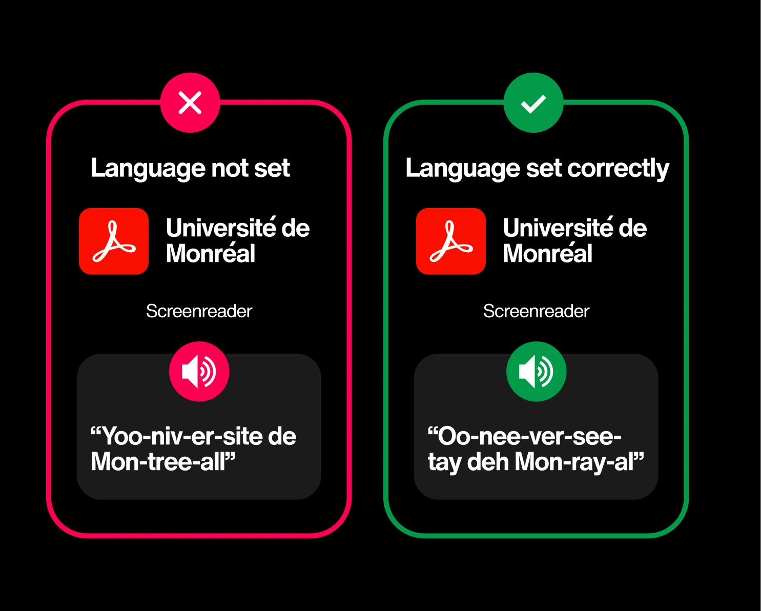
12/ PDFs don’t specify a language`
WCAG: Language of Page · Level A · 54%
One setting tells assistive tech what language a PDF is in, so a screen reader pronounces it correctly. Without it, an English document gets read with the wrong rules — and the international-admissions PDF you translated gets mangled entirely.
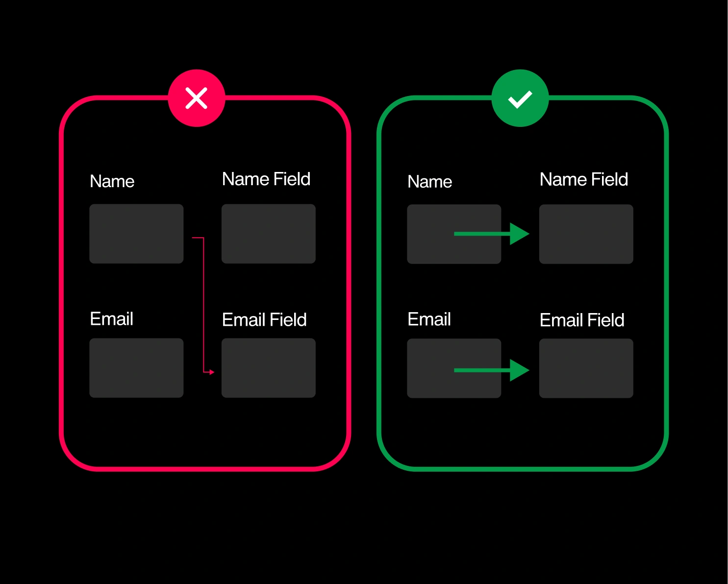
13/ Field purpose not identified for autofill
WCAG: Identify Input Purpose · Level AA · 49%
This rule asks sites to label common fields — name, email, address — in code so browsers can autofill them. About half don’t, switching off a genuine lifeline for people with cognitive or motor disabilities. On application and inquiry forms, that friction quietly costs you submissions too. Autofill makes using your website easier and more efficient for everyone.
14/ Empty headings (a heading with no text)
WCAG: Info and Relationships · Level A · 49%
Screen-reader users navigate a page by hopping between its headings. An empty one, like a heading tag wrapped around an icon, a logo, or nothing at all shows up in that list as a blank rung on the ladder. Around half of university sites have them, sending users to a heading that announces nothing and explains less.
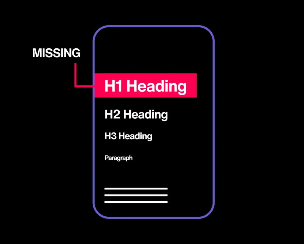
15/ Page missing a top-level heading
WCAG: Info and Relationships · Level A · 44%
Navigation and footer links should be coded as a structured list, so a screen reader can announce the group and its size. On about 1 in 12 sites they’re a loose pile instead — stripping out that grouping right where people navigate most. Small nuance, outsized friction.
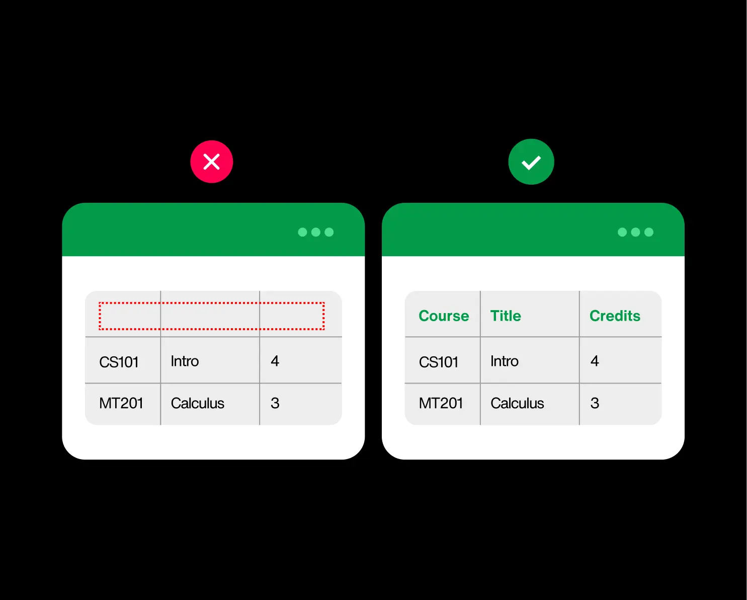
16/ Data tables missing header cells
WCAG: Info and Relationships · Level A · 38%
Higher ed runs on tables — course catalogs, tuition schedules, deadline grids, degree requirements. A proper table marks its header cells so a screen reader can say “row: Course, column: Credits” as the user moves through it. When the headers aren’t marked, the table collapses into a flat stream of values with no idea which is which.
17/ Links signalled by color alone
WCAG: Use of Color · Level A · 39%
If the only thing that makes a link look like a link is its color, anyone who can’t perceive that color (like color-blind users, or anyone on a sun-washed screen) can’t tell it’s clickable. Nearly 4 in 10 university sites rely on color alone. The fix is usually one line of CSS: bring back the underline.