What most US government websites get wrong/
We’ve been tracking web accessibility in government for years in the Silktide Index, an always-growing list of websites that includes the 4,718 websites across state, federal, and counties in the US we scanned for this report. And like the real-life users of your website, the residents trying to apply for a permit, pay a bill, or file for benefits, we’re acutely aware of the ways government still falls short of accessibility.
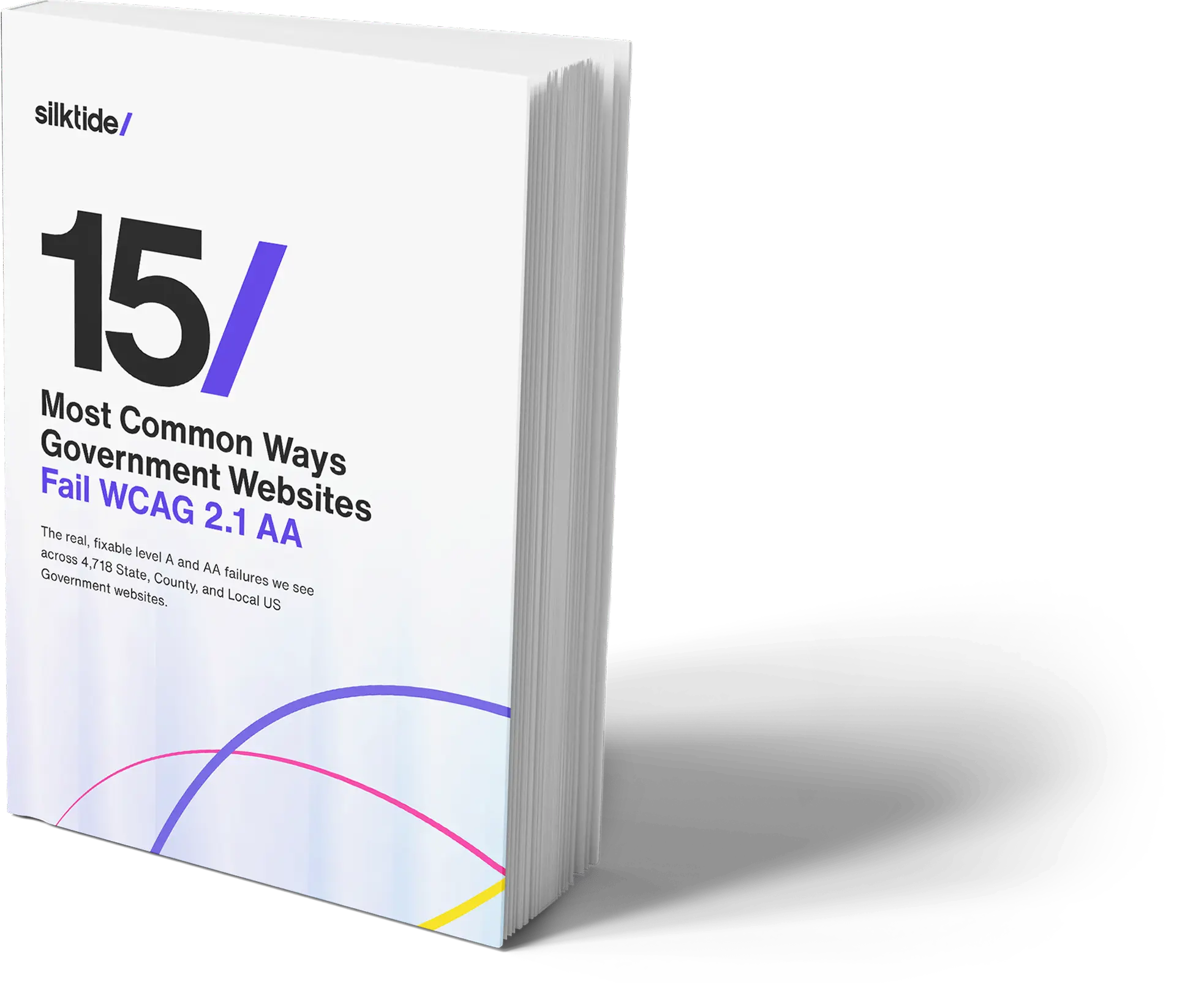
Download the free report
61% of government websites
make the same accessibility mistake
61%
of government websites have links that don’t explain their purpose
The single most common failure is also one of the simplest to fix: links that don’t explain their purpose. You might click “Apply” expecting to start a permit application, only to discover you’ve landed on the parks department’s event calendar.
43%
of government sites have issues with forms
Government websites run on forms: permits, benefits, registrations. On more than 4 in 10 sites the fields are so low-contrast you can’t see where one begins, so low-vision residents miss them and forms go unfinished. The services people need most become the hardest to use.
48%
of government sites fail basic text contrast
Contrast is the brightness gap between text and its background. WCAG 2.1 AA requires at least 4.5:1 for normal text. Nearly half of government sites fall short with light-grey-on-white, or brand colors floated over a photo of city hall. Anyone with low vision, color blindness, or a phone in daylight is left squinting.

“Silktide empowers us to go beyond the basics. It doesn’t just flag issues – it tells us why they matter and how to fix them. That clarity has been a game-changer.”
About Silktide
Silktide is a complete web quality assurance platform with best-in-class automated accessibility testing, plus manual auditing, training, and consultancy. We help universities find every accessibility issue, fix what matters, and prove it.
We also run the Silktide Index: one of the world’s largest public accessibility benchmarks, scoring thousands of organizations against WCAG to help keep track of and measure accessibility on the web.