What most higher education websites get wrong
As the builders of the Silktide Index, we’ve been tracking web accessibility in higher education for years. And like the real-life users of your website, we’re acutely aware of the ways in which higher education still falls short of accessibility. Is your website guilty of any of these 17 all-too-common WCAG 2.1 failures?
Download the free report

96% of College Websites
Fail At Least One of These Checks
The miss on 96% of higher-ed sites
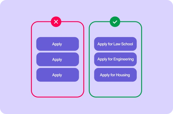
The single most common failure is also one of the simplest to fix: links that don’t explain their purpose. You might be clicking “learn more” hoping to learn more about admissions, only to discover you’re learning more about the charity softball tournament.
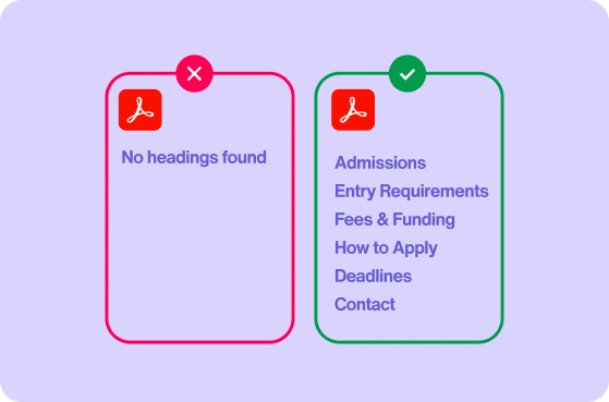
Why 72% of university PDFs are impossible to navigate
Higher ed runs on PDFs, and 72% of sites publish them with no heading structure, so a screen reader is stuck reading the entire document top to bottom until they find the section they were looking for. Headers give clear structure to what information lives where.
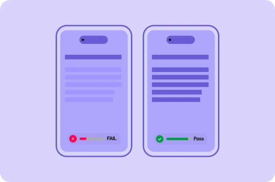
The contrast issue three out of four universities still struggle with
Contrast is the brightness gap between text and its background. WCAG 2.1 AA requires at least 4.5:1 for normal text. Around three-quarters of sites fall short with on-trend light-grey-on-white, or brand colors floated over a photo. Anyone with low vision, color blindness, or a phone in daylight is left squinting.

“It is challenging to keep track of everything under our university's web domain. The web umbrella contains tens of thousands of pages, certainly over 100,000 web pages. Silktide gives us a central location where we can keep an eye on what's going on the web.”
About Silktide
Silktide is a complete web quality assurance platform with best-in-class automated accessibility testing, plus manual auditing, training, and consultancy. We help universities find every accessibility issue, fix what matters, and prove it.
We also run the Silktide Index: one of the world’s largest public accessibility benchmarks, scoring thousands of organizations against WCAG to help keep track of and measure accessibility on the web.
